Deirdre Mulhern Photography
Main Line & Philadelphia Area Photographer

What to Wear for Fall Family Photos!
A Guide to Color Pallets, Outfits, and Style Tips for Fall Family Photos
Fall in the Philadelphia suburbs is truly something special, isn’t it? The air gets cooler, the leaves start showing off with those gorgeous reds and oranges, and it feels like the perfect time to snuggle up with our families. It’s also an amazing time for family photos! With Mother Nature providing such a stunning backdrop, all we need to do is figure out the right colors, outfits, and styles to make those photos something we’ll cherish forever. Then comes the big question, “What should I wear for fall family photos?” But how do we find those picture perfect outfits without stressing over every little detail? There are a few key things to keep in mind to help you choose those perfect fall outfits for your family. Let’s break it down and before you know it you will be well on your way to choosing your fall family photo outfits!
Choosing a Color Palette for a Fall Family Photoshoot
Choosing a color palette is an absolute necessity as the first step in planning outfits for family photos because it sets the foundation for a cohesive and visually pleasing result. When you start with a well-thought-out color palette, you prevent outfits from clashing and get a more cohesive aesthetic to your photos. This gives your photos a more timeless and polished look. Selecting the right color palette draws the eye to the family as a unit, rather than to individual pieces of clothing.
For busy parents, starting with a color palette also simplifies the decision-making process. Once you’ve narrowed down your colors, sorting through dozens of choices for individual outfits online becomes much easier. Knowing your color palette can help you focus on finding pieces that fit within the chosen scheme. This is the time to use the “filter by color” button at your favorite online clothing retailers. This approach not only saves time but also reduces the stress of outfit planning. So let’s dive in and check out three different color palette families. You can’t go wrong choosing one of these when deciding what to wear for fall family photos!
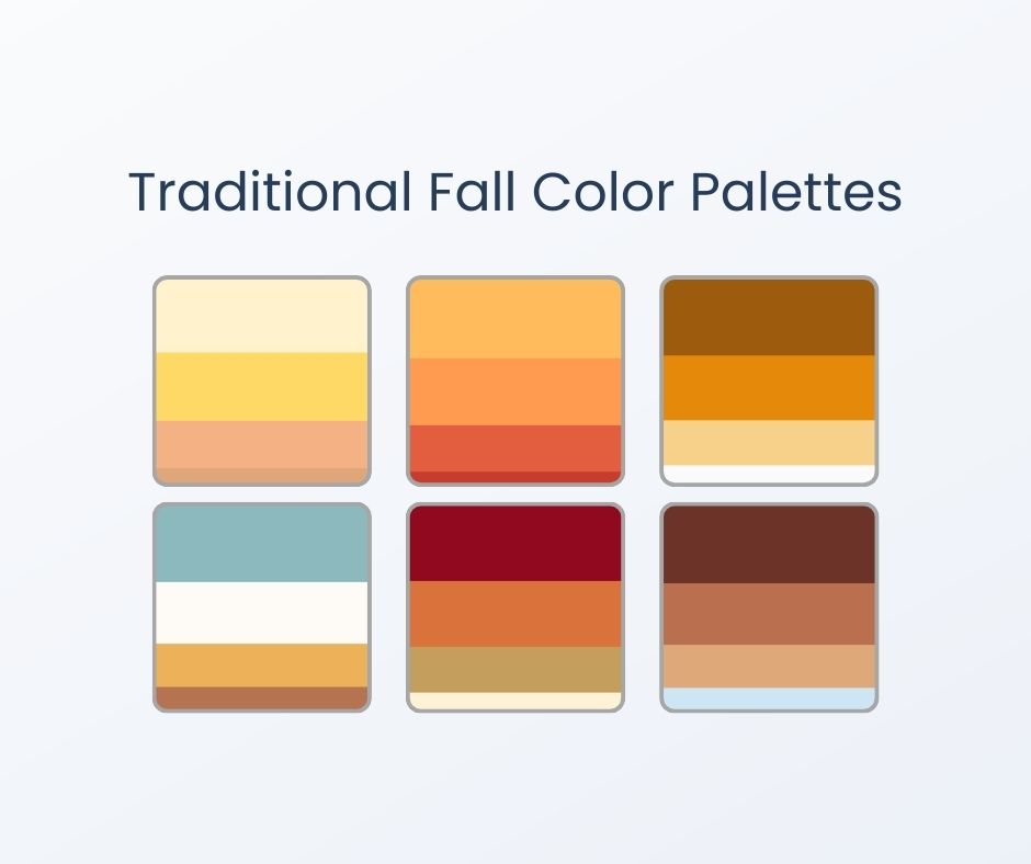
Traditional Fall Colors for Fall Family Photos
The classic fall colors are warm oranges, deep reds, earthy browns, and mustard yellows. Sometimes a little bit of a light greenish blue color may be included. These colors mirror the changing leaves, the golden hues of the harvest, and the richness of the earth, creating a seamless blend with the environment. When you choose these tones for your fall family photos, you’re not just picking nice colors—you’re connecting your photos to the essence of the season. These shades have a way of enhancing the natural backdrop, making the whole scene feel harmonious and timeless.
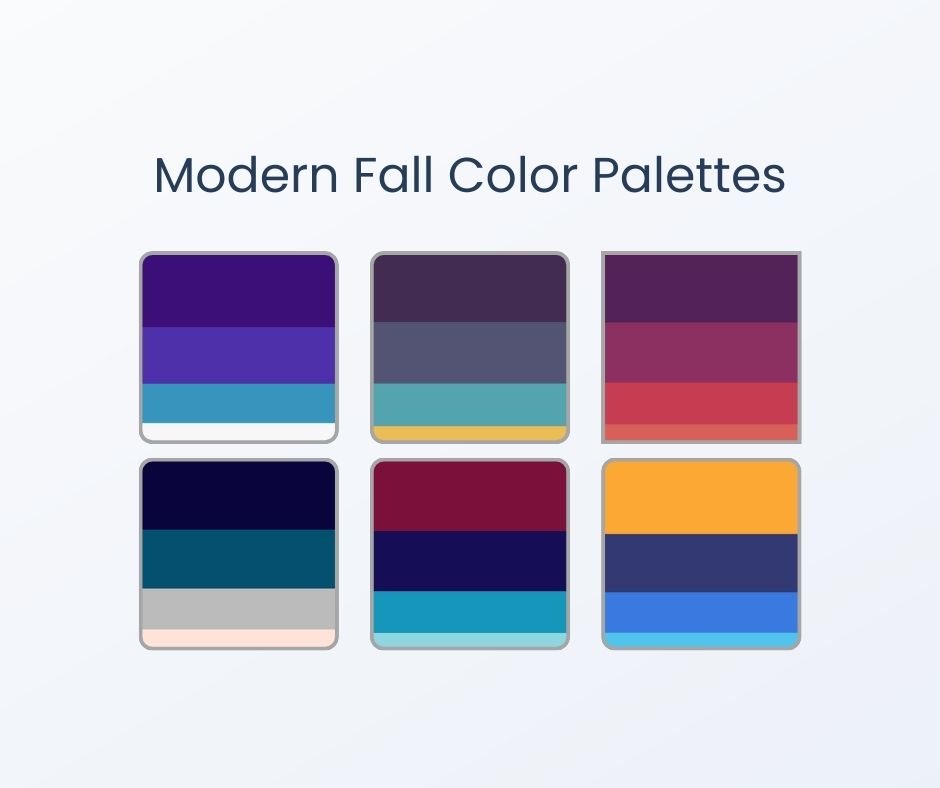
Modern Fall Color Trends for Fall Family Photos
Jewel tones are exactly what they sound like. They are rich and vibrant colors that are inspired by precious gemstones. Think of shades of deep emerald green, sapphire blue, ruby red, and amethyst purple. They are bold and saturated, making them stand out against the scenery. This modern twist on the traditional fall palette is my personal favorite. It also offers a wider variety of color families to choose from when selecting outfits for the family. They’re perfect for adding a pop of color that still feels cozy and fitting for the season. Take a look at just some of the options below.
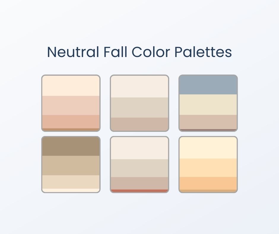
Neutral Fall Color Trends for Fall Family Photos
Black, white, grey, cream, beige, and taupe are the supporting members of the color world. Their job is to complement the other colors you typically see on the color wheel. If the modern or fall palettes are not calling your name, a neutral color palette may be the right choice for you! You really can’t go wrong with any of these palettes. These are just a few examples of neutral color palettes to get you started when deciding what to wear for fall family photos.
Select a Palette that Complements the Location
Think about the location where your photo session will be. Is it still green? Or have the colors changed already? The goal is to stand out and not blend into the background. You want to complement the colors of the location rather than match them exactly. For example, if your suburban Philadelphia family photo session is in very early fall, it’s likely still very green. In this case, you want to be cautious about choosing green as a dominant color in your palette. Green would work better as a pop of color in this situation.
Choosing Outfits for Fall Family Photos
Coordinating without Matching
Matching outfits are when everyone is in the same color, the same style—basically, the “twinsies” approach. Picture everyone in identical blue jeans and white t-shirts, like you’re about to perform a family band’s greatest hits. Cute? Absolutely! But if you are going for more of that authentic, candid look for your fall family photos it may not work. However, I totally encourage families to choose what you love and if matching is your thing then go for it!
Coordinating outfits when deciding what to wear for fall family photos, on the other hand, is all about creating a look that flows together without being too “matchy-matchy.” It’s like a potluck dinner—each dish (or outfit) brings something unique to the table, but it all comes together to create a delicious meal. Maybe mom wears a floral dress with pops of navy and yellow, dad’s in a navy sweater, and the kids have outfits that pick up or complement the colors in mom’s dress. You get the vibe: everyone looks like they belong together without looking like they are copying one another.
However, many of my clients like to dress their little ones in matching outfits while the parents choose something else to wear from the same palette. This can absolutely be adorable without looking too “matchy” and often offers a great balance for someone who loves the matching look but wants more a relaxed and candid vibe for their photos.
So, when in doubt, think coordinating—your photos will have that effortless, pulled-together look, and you’ll all still feel like yourselves…just the best-dressed versions!
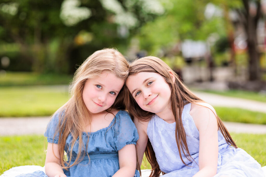
Here’s an example of coordinating but not matching outfits. Each girl is wearing blue but different shades. Both dresses have different textures and cuts. However, since they are from the same color palette, similar level of formality, and contrast well with the location, it works!
Balancing Patterns and Solids
You want your photos to have personality without looking too busy or too plain. A good rule of thumb is to start with one person in a patterned piece—like a plaid shirt or floral dress—and then coordinate the rest of the family with solid colors that complement those patterns. This way, the pattern stands out beautifully without overwhelming the overall look. Think of it like decorating a room: you want a few statement pieces to stand out, while the rest of the decor pulls everything together. You don’t want every pattern competing to be the star of the show.
It’s okay to mix patterns but you want to avoid clashing patterns. For example if one person is wearing stripes, it’s best to avoid someone else wearing large polka dots. When mixing patterns try to find subtle patterns. Look for herringbone, mini florals, textured fabrics like ribbed knit or subtle lace.
Stripes or No Stripes?
Speaking of stripes, it’s important to choose the right type of stripe if you go in this direction. Bold or wide stripes can dominate the frame. You do not want the first thing people notice about the photo to be the stripes someone is wearing. Our eyes and brains are drawn to bold, contrasting, wide stripes. It’s best to avoid these. Additionally, if multiple family members wear stripes, especially in different directions or widths, it can create a chaotic visual, distracting from what should be the focus of the photo – your family! Stripes also don’t always pair well with other patterns, making it harder to create a harmonious ensemble.

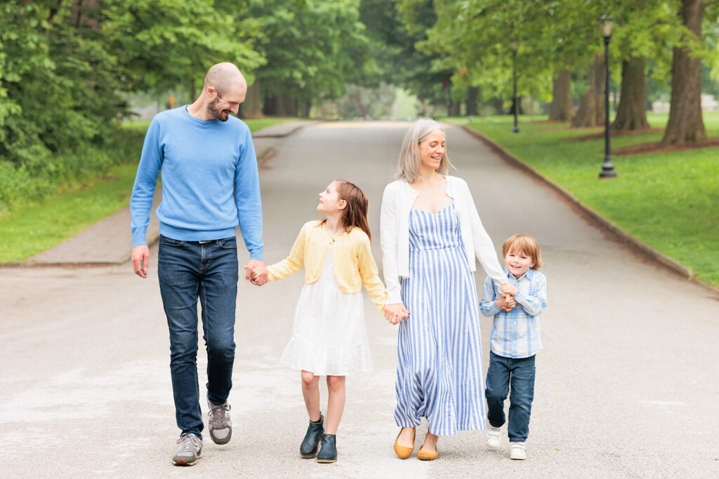
Here’s the color palette from one of my client’s recent photo sessions. This family nailed their outfit choices by perfectly combining stripes and plaid with a cohesive color scheme. Notice how the mom’s striped dress is just right and not distracting, while the little one’s plaid shirt adds interest without overwhelming the look. The plaid he is wearing has blue, yellow and white which matches at least one color in the clothing of his family members. Since each outfit complements the others, allowing for a variety of combinations in the photos. Even though blue was their main color, not every member needed to wear it to make this work. This thoughtful coordination made for a seamless and stylish session—definitely style goals!
A Technical Note
On a technical note, in some cases, stripes—especially very thin or tightly spaced ones—can cause a visual effect called “moiré” in photos, where the pattern appears to shimmer or distort. This is due to the way digital cameras capture fine patterns and can be distracting in the final image. To see this in action, browse around any clothing store’s site and look for shirts with stripes. You will see the illusion right on your screen!
Dressing for Comfort & Style for Fall Family Photos
This is a big one and can sometimes make or break your session. You and your family need to be comfortable in what you are wearing. If one of the kids really doesn’t like bowties, don’t force it. Itchy dresses are also a no go. In order to get those genuine smiles, kids (and parents!) need to be comfy and not distracted by their outfits. Here are some things to look for when selecting comfortable clothing that your family can move and play in.
Kids’ Outfits
Choose clothes that allow kids to move, play, and be themselves. Overly tight or restrictive clothing can lead to discomfort and crankiness. Choose items that have some stretch and allow for freedom of movement. Think about dresses or pants with elastic waists. Sweaters look dressy without being too formal. Be on the lookout for any itchy tags that may bother your child during the session.
The same goes for shoes. Select comfortable shoes that can handle walking and standing. Boots are a great fall option that’s both stylish and practical. I always suggest avoiding new shoes. Make sure to break in any new shoes beforehand to prevent blisters or discomfort during the session. Some of my clients bring extra shoes for their little ones to change into for after the session.
Consider the Weather
Fall is a tricky season in the Philadelphia suburbs when trying to decide what to wear for fall family photos. It could be eighty degrees or forty degrees. One year we even had snow before Halloween! Think ahead about how you can modify your outfits if needed.
Layering can add depth and texture to the photos while keeping everyone comfortable in varying temperatures. Look for light sweaters, cardigans, or vests that can be added or removed easily while still looking intentional. This keeps everyone warm without the bulk. If this layer needs to be removed, the outfit doesn’t suffer. Undershirts are a good idea if it’s extra cold out.
Incorporating Accessories
Remember your chosen pallet and look for coordinating accessories. Accessories like scarves, hats, and jewelry that can enhance the outfits without overwhelming the photos. Hairbows are always a hit along with easy-to-wear hats or simple scarves that won’t require constant adjustment. If needed, choose scarves and gloves that are soft and cozy, and that coordinate well with the overall look.
Ready, Set, Go!
Choosing what to wear for fall family photos can be exhausting. Trust me! I’ve been there! There are many online retailers in addition to brick and mortar stores that have great affordable options for fall family photos. I’m also a huge fan of shopping your own closet! If you follow these tips, you should be headed in the right direction. If you find several outfit options and need additional help, please reach out! I’m happy to offer advice and suggestions about what will look great at your chosen location! Take a look at more photos from the sessions featured on this page
August 18, 2024
